Configuration
Configure your site settings.
Goal: Customize colors, fonts, and design tokens.
Learn about the powerful styling system in Astro Swiss Theme.
The theme uses a layered CSS architecture for maximum flexibility:
global.css (entry point)├── starwind.css ← Starwind UI component styles├── tokens.css ← Design tokens (colors, spacing, shadows)├── themes/│ ├── light.css ← Light mode overrides│ └── dark.css ← Dark mode overrides└── utilities.css ← Custom utility classesFile: src/styles/tokens.css
Design tokens are CSS variables that define your brand’s visual identity.
:root {  /* Primary accent color */  --accent: #fc4a1a;  --accent-dark: #f7b733;  --accent-rgb: 252, 74, 26;
  /* Secondary color */  --secondary: #FFB36B;}
Usage:
.button { background: var(--accent); color: var(--primary-foreground);}Defined as RGB values for flexibility with opacity:
:root { --black: 15, 18, 25; --gray: 96, 115, 159; --gray-light: 229, 233, 240; --gray-dark: 34, 41, 57;}Usage with opacity:
.overlay { background: rgba(var(--black), 0.5); /* 50% opacity */}Semantic tokens provide meaning-based naming:
:root {  /* Text colors */  --color-text-primary: rgb(var(--black));  --color-text-secondary: rgb(var(--gray-dark));  --color-text-muted: rgb(var(--gray));
  /* Background colors */  --color-bg-primary: var(--background);  --color-bg-secondary: rgba(0, 0, 0, 0.03);  --color-bg-tertiary: rgba(0, 0, 0, 0.05);
/* Borders */ --color-border: rgba(0, 0, 0, 0.12); --color-border-light: rgba(0, 0, 0, 0.08);}The theme supports automatic light/dark mode switching based on user preference.
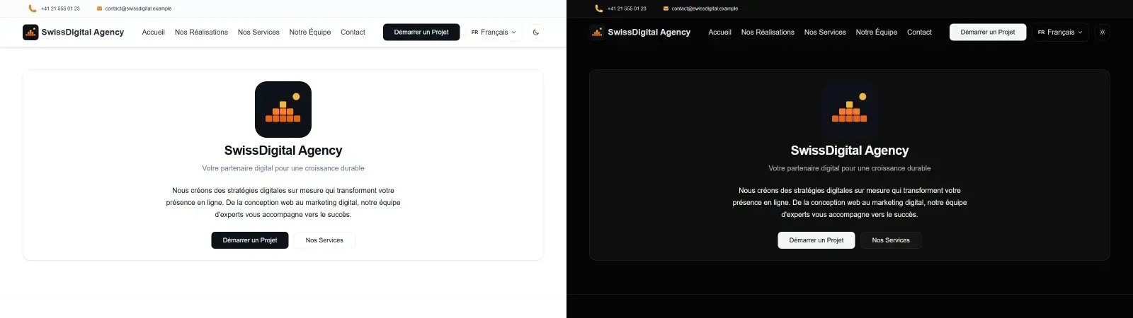
File: src/styles/themes/light.css
[data-theme="light"] { --accent: #FF7A1A; --background: #ffffff; --foreground: #0f1219; --card: #ffffff; /* ... more overrides */}File: src/styles/themes/dark.css
[data-theme="dark"],.dark { --accent: #f7b733; --background: #050505; --foreground: rgb(243, 244, 246); --card: rgba(255, 255, 255, 0.04); /* Translucent */ /* ... more overrides */}The BaseLayout.astro includes an inline script to prevent FOUC (Flash of Unstyled Content):
const isDark =  localStorage.theme === "dark" ||  (!("theme" in localStorage) &&    window.matchMedia("(prefers-color-scheme: dark)").matches);
document.documentElement.classList.toggle("dark", isDark);document.documentElement.setAttribute("data-theme", isDark ? "dark" : "light");
This runs before page render to apply the correct theme immediately.
Edit src/styles/tokens.css:
:root {  /* Change your primary brand color */  --accent: #3b82f6;  /* Blue instead of orange */  --accent-rgb: 59, 130, 246;
/* Change secondary color */ --secondary: #8b5cf6; /* Purple */}For different colors in light vs. dark mode:
[data-theme="light"] { --accent: #3b82f6; /* Bright blue */}[data-theme="dark"] { --accent: #60a5fa; /* Lighter blue for dark backgrounds */}Add new color tokens:
:root { --brand-purple: #8b5cf6; --brand-green: #10b981; --brand-pink: #ec4899;}Use in components:
.special-button { background: var(--brand-purple);}When customizing your brand colors, follow this comprehensive checklist to ensure all color references are updated consistently across your site.
Use this checklist to ensure you’ve updated all color references:
File: src/styles/tokens.css
:root {  /* Update your primary brand color */  --accent: #YOUR_BRAND_COLOR;  --accent-rgb: R, G, B;  /* RGB values of your brand color */
/* Update secondary color */ --secondary: #YOUR_SECONDARY_COLOR;}Update colors for both light and dark modes:
File: src/styles/themes/light.css
[data-theme="light"] { --accent: #YOUR_BRAND_COLOR; --background: #ffffff; --foreground: #0f1219;}File: src/styles/themes/dark.css
[data-theme="dark"] { --accent: #YOUR_BRAND_COLOR_DARK; /* Often lighter for dark backgrounds */ --background: #050505; --foreground: rgb(243, 244, 246);}Search your codebase for hardcoded colors:
Use your code editor’s search function to find hex color values:
#fc4a1a (default orange)#f7b733 (default gradient color)Common locations to check:
src/components/**/*.astro)src/pages/**/*.astro)Example - Hardcoded gradient:
<!-- ❌ Before: Hardcoded colors --><div style="background: linear-gradient(135deg, #fc4a1a 0%, #f7b733 100%);">
<!-- ✅ After: Using CSS variables --><div style="background: linear-gradient(135deg, var(--accent) 0%, var(--accent-dark) 100%);">Ensure semantic tokens reference the correct base tokens:
:root {  /* ✅ Good: Semantic tokens reference base tokens */  --color-text-primary: var(--foreground);  --color-bg-primary: var(--background);
/* ❌ Bad: Hardcoded values */ --color-text-primary: #0f1219;}Use these tools to verify contrast ratios:
Example - Good vs. Bad Contrast:
/* ✅ Good: High contrast (7.5:1) */--foreground: #0f1219;--background: #ffffff;
/* ⚠️ Caution: Borderline (4.6:1) */--foreground: #666666;--background: #ffffff;
/* ❌ Bad: Fails WCAG AA (2.8:1) */--foreground: #999999;--background: #ffffff;
Dark mode often requires different color adjustments:
/* Light mode - darker accent works */[data-theme="light"] {  --accent: #3b82f6;  /* Blue */}
/* Dark mode - lighter accent for better contrast */[data-theme="dark"] { --accent: #60a5fa; /* Lighter blue */}Here’s a complete example of rebranding from orange to blue:
--accent: #fc4a1a;--accent-dark: #f7b733;--accent-rgb: 252, 74, 26;--secondary: #FFB36B;--accent: #3b82f6;--accent-dark: #1d4ed8;--accent-rgb: 59, 130, 246;--secondary: #8b5cf6;
/* themes/light.css */[data-theme="light"] { --accent: #3b82f6;}
/* themes/dark.css */[data-theme="dark"] { --accent: #60a5fa; /* Lighter for dark backgrounds */}After updating your colors, verify the changes:
#fc4a1a, #f7b733) in your codebaseFile: src/styles/global.css
The theme uses Poppins font:
@font-face {  font-family: "Poppins";  src: url("/fonts/Poppins-Regular.ttf") format("ttf");  font-weight: 400;  font-style: normal;  font-display: swap;}
body { font-family: "Poppins", sans-serif; font-size: 20px; line-height: 1.7;}Example - Using Inter:
@font-face {  font-family: "Inter";  src: url("/fonts/Inter-Regular.woff2") format("woff2");  font-weight: 400;  font-display: swap;}
body { font-family: "Inter", system-ui, sans-serif;}Defined in tokens.css:
:root { --shadow-sm: 0 1px 2px rgba(0, 0, 0, 0.08); --shadow-md: 0 4px 6px rgba(0, 0, 0, 0.1); --shadow-lg: 0 8px 15px rgba(0, 0, 0, 0.12); --shadow-xl: 0 12px 25px rgba(0, 0, 0, 0.16); --shadow-2xl: 0 25px 50px rgba(0, 0, 0, 0.2);}Dark mode uses heavier shadows for better depth perception:
[data-theme="dark"] { --shadow-sm: 0 1px 2px rgba(0, 0, 0, 0.18); --shadow-md: 0 6px 14px rgba(0, 0, 0, 0.28); --shadow-lg: 0 10px 28px rgba(0, 0, 0, 0.35);}:root { --radius: 0.75rem; /* 12px */}Tailwind also provides radius utilities: rounded-sm, rounded-md, rounded-lg, rounded-xl, rounded-2xl.
The theme uses Tailwind CSS v4 with CSS variables for theming.
<div class="p-4 bg-primary text-primary-foreground rounded-lg shadow-md"> Styled with Tailwind</div>Tailwind v4 uses @theme directive in CSS. Edit src/styles/starwind.css to extend:
@theme inline { --color-brand: var(--accent); --spacing-huge: 5rem;}Use in HTML:
<div class="bg-brand p-huge">Custom utilities</div>--color-text-primary not --dark-gray)#fc4a1a is just a placeholder for your brand colortokens.css - check theme files and templates tooEnsure WCAG AA compliance (4.5:1 for normal text):
/* ✅ Good - high contrast */--foreground: #0f1219;--background: #ffffff;
/* ❌ Bad - low contrast */--foreground: #cccccc;--background: #ffffff;| What to Customize | File | Variable |
|---|---|---|
| Primary brand color | tokens.css |
--accent |
| Secondary color | tokens.css |
--secondary |
| Background color | themes/light.css or dark.css |
--background |
| Text color | themes/light.css or dark.css |
--foreground |
| Border radius | tokens.css |
--radius |
| Shadows | tokens.css |
--shadow-* |
| Font family | global.css |
font-family in body |
| Font size | global.css |
font-size in body |
Configuration
Configure your site settings.
Add Languages
Add multilingual support.
Deploy
Deploy your styled site to production.